Course Name.
Excel Visual Data Analysis in Action
Course Duration.
12 hours
Instructor: Mr. Kennedy
Mr. Sun – a top data analyst with 27+ years of Fortune 500 work experience
Course Features.
- Comprehensive coverage of data visualization skills: the course covers visualization charts from beginner to advanced, helping students master all core skills of Excel data visualization.
- KPIs and Data Kanban: Learn how to build Key Performance Indicators (KPIs), create dynamic dashboards, and design professional data Kanban boards for business data analysis.
- Storytelling Skills: Teach participants how to tell stories through data, transform complex data into intuitive visualization reports, and enhance business decision support capabilities.
- Wide range of applications: The course is applicable to the data analysis needs of a variety of industries, such as finance, accounting, etc., to enhance the application value in practical work.
- Efficient Interactive Learning: Through the live and replay teaching mode, students can flexibly arrange their study time and participate in interactive Q&A in real time.
Suitable for.
- Workplace Excel users: workplace people who want to systematically improve Excel data visualization skills.
- Data analysis practitioners: especially those in finance, accounting and other fields who need to improve the professionalism of data display and presentation.
- Business decision makers: Management and analysts who need to support business decisions through data visualization.
Course Description.
The Excel Visual Data Analysis Practical Course is tailored for working professionals who wish to improve their data presentation skills. Taught by top data analysts with more than 27 years of experience in Fortune 500 companies, the course is a 12-hour live broadcast that systematically explains all levels of Excel data visualization for a wide range of industry applications.
This course will cover essential data visualization and analysis skills for the Excel workplace, including:
- Comprehensive mastery of the most useful beginner, intermediate and advanced visualization charts
- Techniques for building KPIs and creating dynamic dashboards
- Skills in storytelling with data so that it conveys a clear business message
- Processes and applications for designing business big data Kanban boards
- Develop the workplace mindset necessary for data analytics
During the course, participants will systematically learn to create various types of visualization charts, build KPIs and design dynamic dashboards, and master how to use data to support business decisions. These skills will help students to enhance their competitiveness in the workplace, and independently complete the data presentation and analysis work in a complex data environment.
Learning Arrangement:
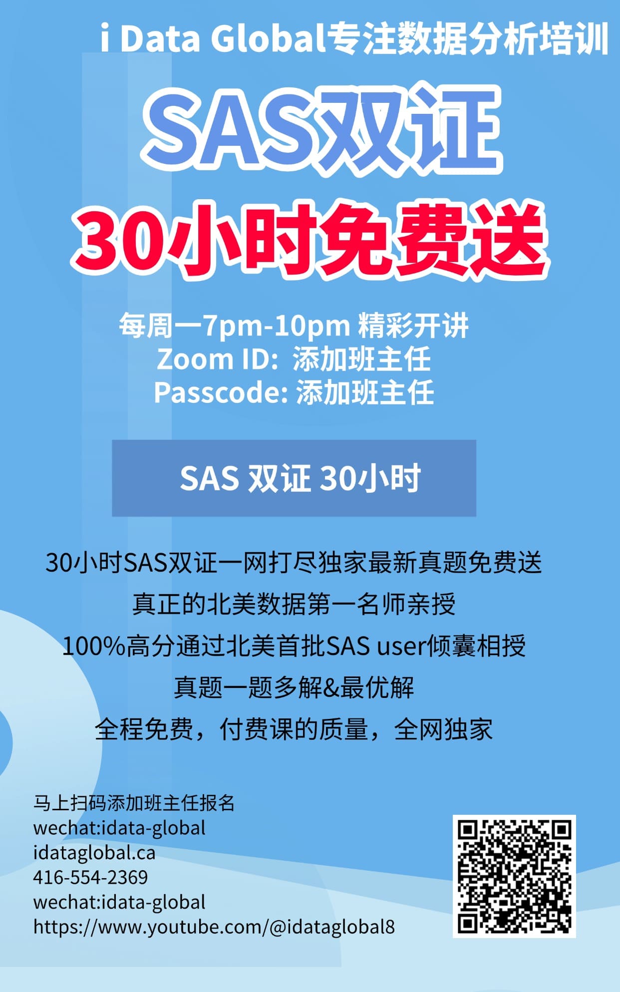
Free Live Streaming: every Wednesday, 7pm-10pm Toronto time
Free replay: Every Sunday, 2pm-5pm Toronto time