数据分析科普 3–可视化工具大PK

Slide 1

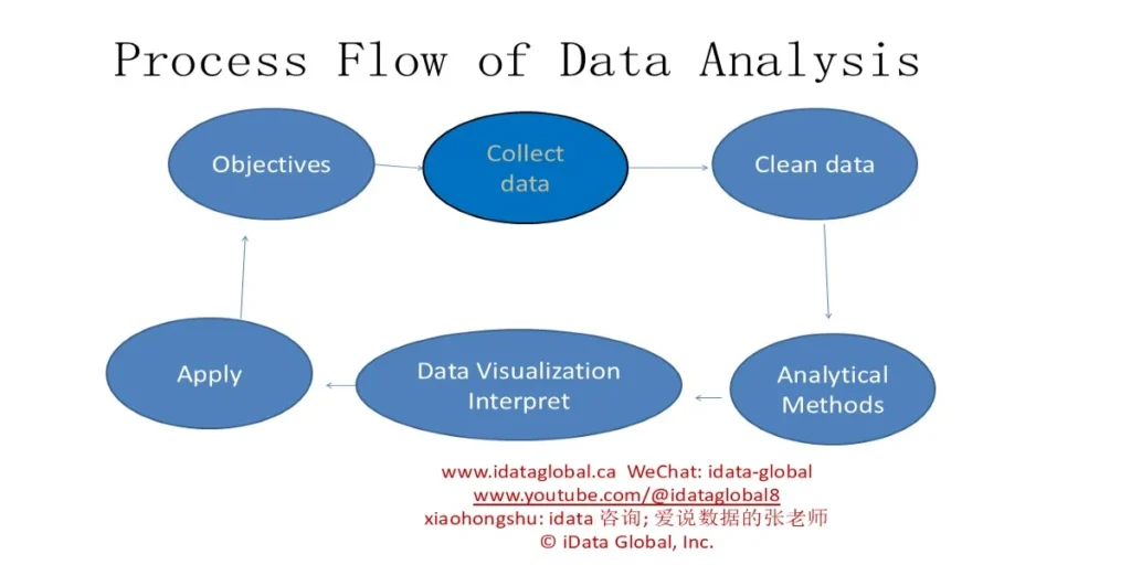
Process Flow of Data Analysis
- Objectives
- Clean data
- Collect data
- Apply Data Visualization
- Interpret Analytical Methods
Slide 2

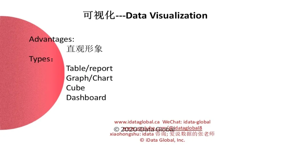
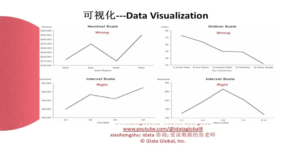
可视化—Data Visualization
Advantages:
Types:
- Table/report
- Graph/Chart
- Cube
- Dashboard
- © 2020 iData Global
Slide 3

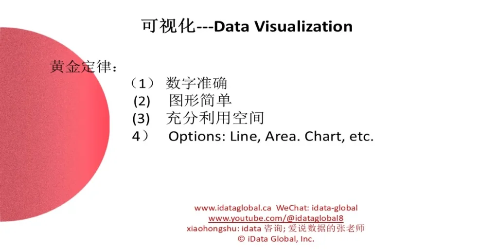
可视化—Data Visualization
黄金定律:
- 数字准确
- 图形简单
- 充分利用空间
- Options: Line, Area Chart, etc.

可视化—Data Visualization
Slide 5


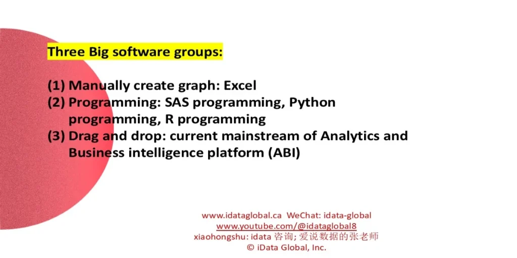
Three Big software groups:
- Manually create graph: Excel
- Programming: SAS programming, Python programming, R programming
- Drag and drop: current mainstream of Analytics and Business intelligence platform (ABI)

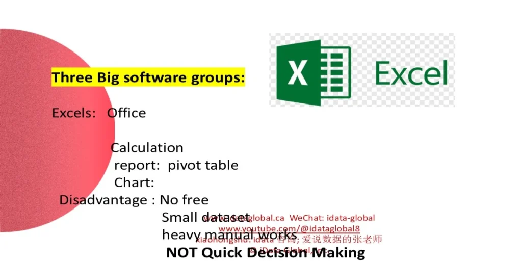
Three Big software groups:
- Excels: Office Calculation, report: pivot table, Chart
- Disadvantage : No free, Small dataset, heavy manual works, NOT Quick Decision Making
Slide 7

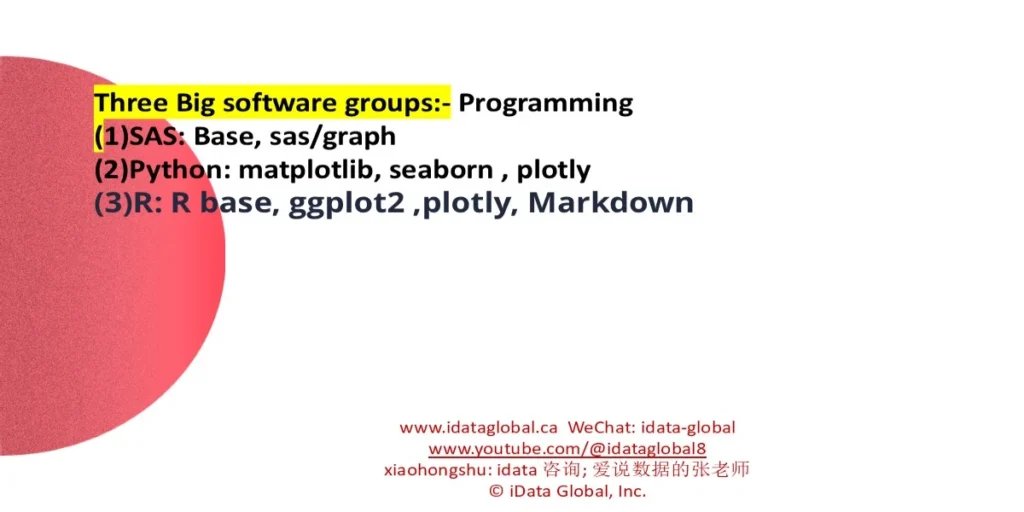
Three Big software groups: Programming
- SAS: Base, sas/graph
- Python: matplotlib, seaborn, plotly
- R: R base, ggplot2, plotly

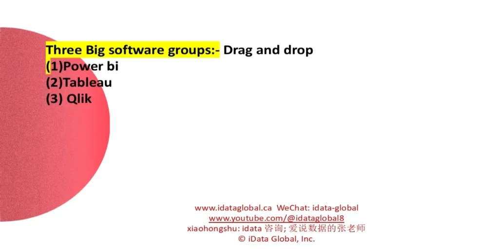
Three Big software groups: Drag and drop
- Power bi
- Tableau
- Qlik

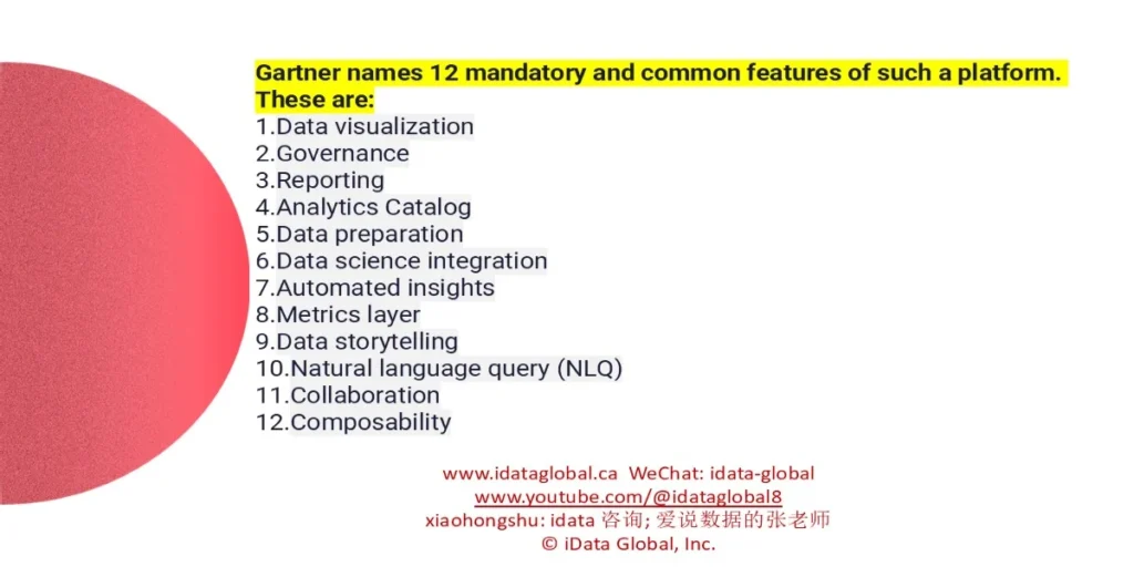
Gartner names 12 mandatory and common features of such a platform.

- Data visualization
- Governance
- Reporting
- Analytics Catalog
- Data preparation
- Data science integration
- Automated insights
- Metrics layer
- Data storytelling
- Natural language query (NLQ)
- Collaboration
- Composability
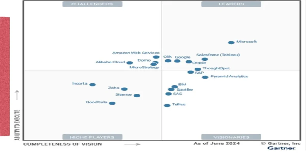
This year’s Leaders are:

- Microsoft
- Salesforce (Tableau)
- Oracle
- ThoughtSpot
- Google
- Qlik

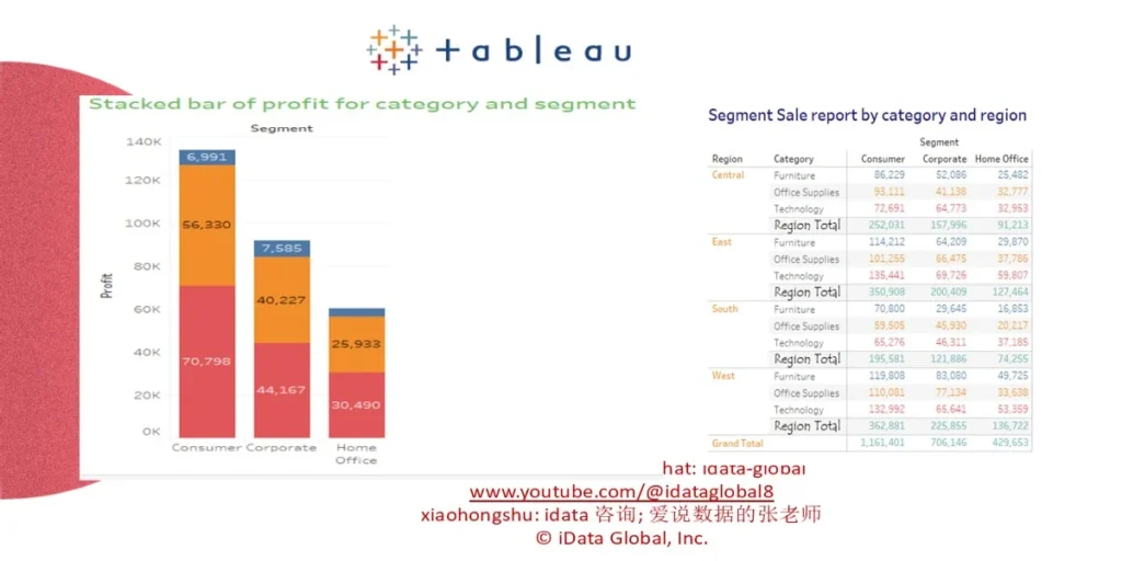
- (1) Leading Data Visualization Tool
- (2) Apply in small, medium, large companies
- (3) Drag and Drop, few programming
- Tableau public : Free
- Tableau desktop: 14 days free trial

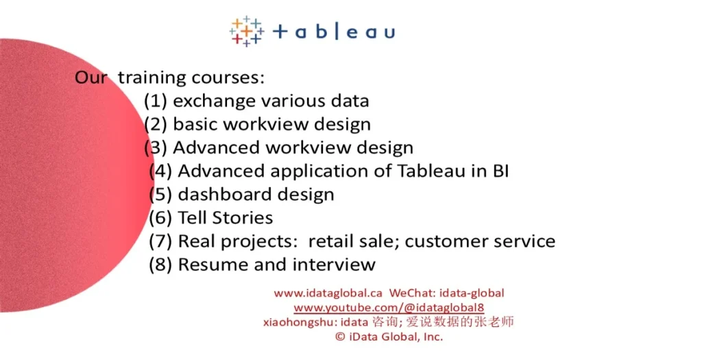
Our training courses:
- (1) exchange various data
- (2) basic workview design
- (3) Advanced workview design
- (4) Advanced application of Tableau in BI
- (5) dashboard design
- (6) Tell Stories
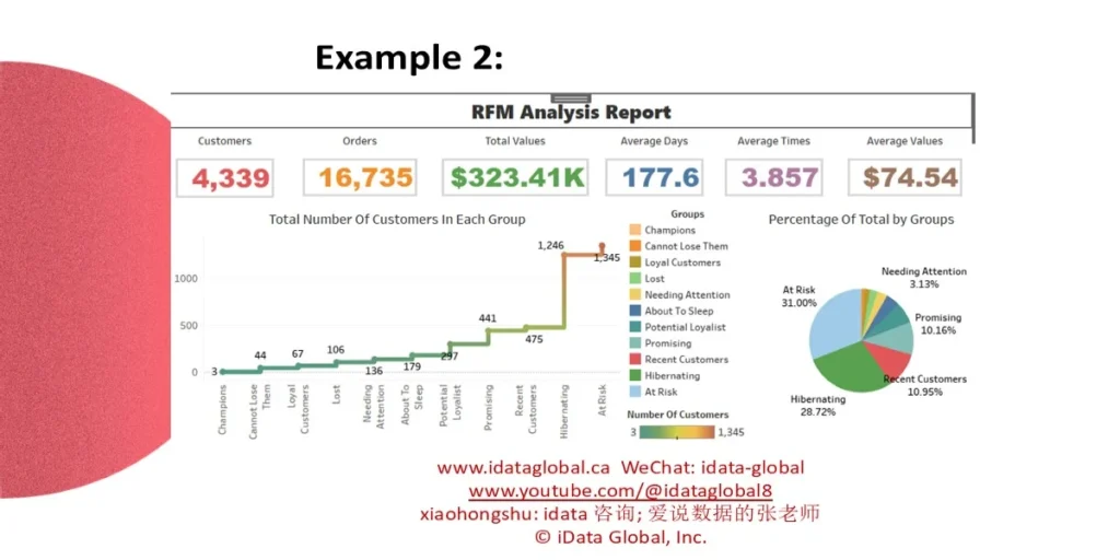
- (7) Real projects: retail sale; customer service
- (8) Resume and interview


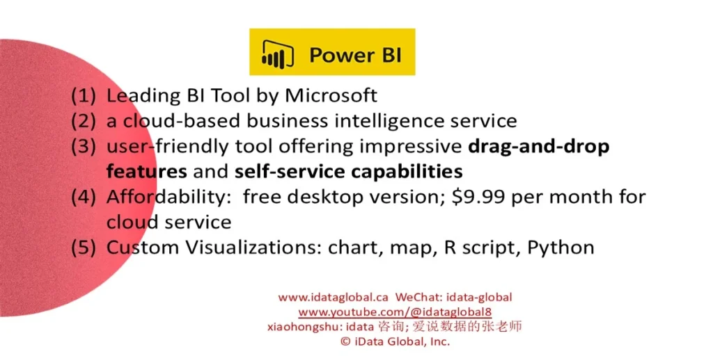
Leading BI Tool by Microsoft
- a cloud-based business intelligence service
- user-friendly tool offering impressive drag-and-drop features and self-service capabilities
- Affordability: free desktop version; $9.99 per month for cloud service
- Custom Visualizations: chart, map, R script, Python

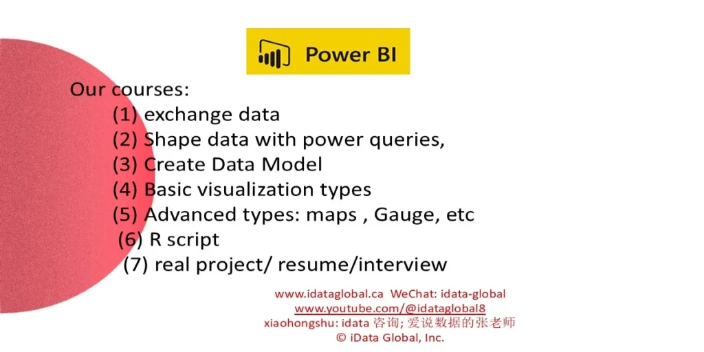
Our courses:
- (1) exchange data
- (2) Shape data with power queries
- (3) Create Data Model
- (4) Basic visualization types
- (5) Advanced types: maps , Gauge, etc
- (6) R script
- (7) real project/ resume/interview


Contact Details
